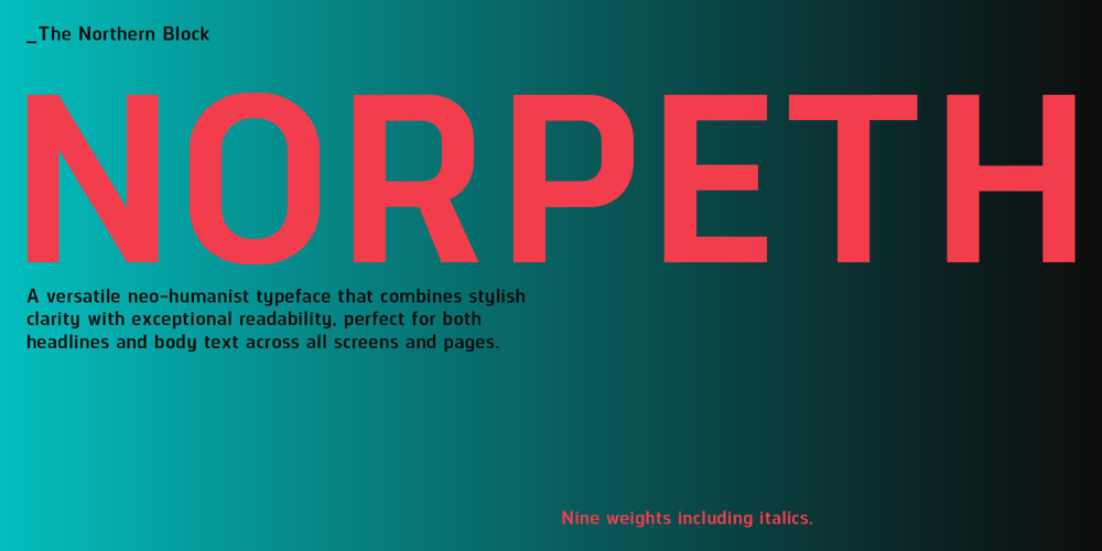
Norpeth Font Family was designed by Jonathan Hill and published by The Northern Block. Norpeth contains 18 styles and family package options. A neo-humanist sans serif that balances geometric structure with humanist warmth. Its strong lateral rhythm enhances on-screen readability, while deliberate tapers and nuanced transitions between curves and vertical stems add refinement. Designed for versatility, Norpeth brings a stylish presence to headlines without compromising clarity in body text. Consistent stroke contrast across weights ensures optical balance and harmony.Details include nine weights with matching italics, a character set of over 570 glyphs, and meticulously crafted kerning for optimal spacing. Norpeth also offers an extensive selection of symbols and seven styles of figures, including lining, tabular, numerators, and denominators. With full support for Cyrillic and comprehensive language coverage across Europe, it is a highly adaptable choice for both display and editorial use.


