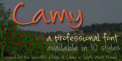
Camy Font Family was designed by Anton Scholtz and published by Scholtz Fonts. Camy contains 10 styles and family package options. I wanted to create a “handwriting” font which could be used professionally. I have often needed such a font with a variety of weights and styles for a particular project and have had to resort to mixing fonts, creating a rather messy, amateur job. Camy is named for a little village in South West France where I did much of the initial work on this font. Camy is ideal for contemporary display work, comes in ten styles, and has a contemporary appeal with its casual, easy to read letters. Camy was designed as a total professional package for designers looking for a handwritten font suitable for all kinds of contemporary display work: the idea being that once you have the Camy Professional Pack you don’t have to waste time searching for other handwritten fonts. The Family: LIGHT — NARROW – light weight, condensed width, delicate line — MEDIUM – light weight, delicate line — WIDE – light weight, expanded width, delicate line NORMAL WEIGHT — NARROW – of medium weight and condensed width – perfect for limited space — MEDIUM – of medium weight — WIDE – of medium weight and expanded width BLACK – for best readability — NARROW – condensed width for bolder statements in small areas without losing legibility — MEDIUM – for bolder statements — WIDE – expanded width for bolder statements FAT — WIDE – for maximum impact Use a combination of styles for product branding, book covers, invitations, greeting cards. The Camy combination works well for both headings and body text. Camy contains over 250 characters – (upper and lower case characters, punctuation, numerals, symbols and accented characters are present). It has all the accented characters used in the major European languages.