Download
ID , 'foundry' );
if (!empty($terms) && !is_wp_error($terms)) {
foreach ( $terms as $term ) {
$term_link = get_term_link( $term, 'foundry' );
echo "Publisher: " . $term->name . "";
} } ?>
ID , 'designer' ); if (!empty($terms) && !is_wp_error($terms)) { foreach ( $terms as $term ) { $term_link = get_term_link( $term, 'designer' ); echo "Designer: " . $term->name . ""; } } ?>
ID ) ) . ' font" class="img-fluid">'; } ?>
ID , 'designer' ); if (!empty($terms) && !is_wp_error($terms)) { foreach ( $terms as $term ) { $term_link = get_term_link( $term, 'designer' ); echo "Designer: " . $term->name . ""; } } ?>
User Rating: Be the first one!
ID ) ) . ' font" class="img-fluid">'; } ?>
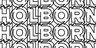
AT Move Holborn Font Family was designed by André Toet, Jasper Nijssen and published by André Toet Design. AT Move Holborn contains 1 styles and family package options. HOLBORN Aptly named after ‘High Holborn’, a high-street in London where the Central School of Art & Design was based. A font, just in capitals, based on the original design and the earlier sketches (1976) by André Toet. The strong optical illusion in this alphabet makes it an outstanding typeface. Concept/Art Direction/Design: André Toet © 2017