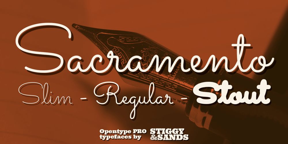
Sacramento Pro Font Family was designed by Jim Lyles, Brian J. Bonislawsky and published by Stiggy & Sands. Sacramento Pro contains 3 styles and family package options. The Sacramento Pro family of typefaces was inspired by a monoline, semi-connected script from hand-lettering artist brochure work of the 1950’s and 1960’s. With its sophisticated upright stance, it stands on a thin line between formal and casual lettering styles, yet it has a commanding presence for headlines and titles. The Slim adds a fine pen-line style, while the Stout style expands the formal/casual dichotomy much further than the original weight. Opentype features include: – Contextual Alternates for initial and final forms. – Stylistic Alternates for an alternate lowercase t. – Discretionary Ligatures* for catch words like “and”, “at”, “by”, “for”, “of”, “or”, “the”, “to”, and “with”. – Full set of Inferiors and Superiors for limitless fractions. – Proportional and Oldstyle figure sets. * Discretionary Ligatures not included in the Stout style due to heavyweight nature.


