ID , 'designer' ); if (!empty($terms) && !is_wp_error($terms)) { foreach ( $terms as $term ) { $term_link = get_term_link( $term, 'designer' ); echo "Designer: " . $term->name . ""; } } ?>
ID ) ) . ' font" class="img-fluid">'; } ?>
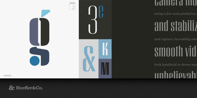
Peristyle Font Family was designed by Jonathan Hoefler and published by Hoefler & Co.. Peristyle contains 18 styles and family package options. A family of stylish condensed typefaces, designed to restore the effortless chic of the high-contrast sans. The Peristyle typeface was designed by Jonathan Hoefler in 2017. A family of tall, high contrast sans serifs, Peristyle nods to the soaring typefaces that grew up around the modern skyscraper such as Imre Reiner’s Corvinus (1935), Morris Fuller Benton’s Empire (1938), and Robert Hunter Middleton’s Radiant (1940). From the desk of the designer: So deeply ingrained is our sense of typographic proportion that even the subtlest changes can stand out to a reader. A typeface’s weight is either regular or extreme; the size of its lowercase either goes unnoticed, or appears delicate and precious (if it’s especially small) or gentle and youthful (if it’s especially large.) Contrast is one of typography’s more curious characteristics: the relationship between thick and thin strokes, a distant vestige of calligraphy, is present in even the most mechanical and geometric typefaces. Amplifying an alphabet’s contrast turns up the drama, making it feel strange and exotic, a device that’s long been used by novelty typefaces. There are high-contrast faces that buzz with high-tech sparkle, using unexpected geometries to look futuristic, and others that feel old-fashioned, employing all the details of thirties Art Deco or sixties funk. But what if a typeface worked to avoid looking forward or backward, and instead summoned all the energy of contrasting darkness and light to create a typeface for today? Peristyle is a family that dodges eccentricity, to find drama, elegance, and style.