ID , 'designer' ); if (!empty($terms) && !is_wp_error($terms)) { foreach ( $terms as $term ) { $term_link = get_term_link( $term, 'designer' ); echo "Designer: " . $term->name . ""; } } ?>
ID ) ) . ' font" class="img-fluid">'; } ?>
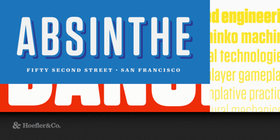
Tungsten Rounded Font Family was designed by Tobias Frere-Jones with Jonathan Hoefler and published by Hoefler & Co.. Tungsten Rounded contains 6 styles and family package options. From Tungsten, a typeface that’s disarming instead of pushy, comes a soft-shouldered cousin with an unexpected personality. The Tungsten Rounded typeface was designed by Tobias Frere-Jones with Jonathan Hoefler in 2013. An adaptation of their Tungsten typeface (2004), Tungsten Rounded adds soft exterior corners to the modular sans serif style colorfully known to sign painters as ‘gaspipe lettering.’ Tungsten Rounded was created for Wired magazine in whose pages the typeface first appeared in 2013. From the desk of the designer: The rounded sans serif is a typographic chameleon. It can look relaxed and natural, as if its soft edges have been weathered by erosion; it can be cool and detached, machined with the accuracy of a precision part, or stamped with the indifference of a license plate. Its weight can affect its tone dramatically, changing the mood from the no-frills immediacy of a rubber stamp to the fleshy abundance of an over-inked printing plate. It can be burly and jovial, youthful, high-tech, wry, earnest, or energetic, all voices explored by Tungsten Rounded. Across six styles from Light to Black, Tungsten Rounded varies the relationship between the weights of letters and the radius of their curves, to create a distinctively different personality in each style. Its lighter weights have an engineered quality, reminiscent of the engraved markings on scientific instruments, or the rounded grooves of lettering templates. As the font gets heavier, its middle weights take on a more direct and dynamic tone, moving from upbeat pop to editorial gravitas. Its Black weight is the most malleable, solemn when letterspaced and exuberant when tightly tracked, moods that are both improved by a collision detection feature in the fonts that improves their texture at large sizes.