ID , 'designer' ); if (!empty($terms) && !is_wp_error($terms)) { foreach ( $terms as $term ) { $term_link = get_term_link( $term, 'designer' ); echo "Designer: " . $term->name . ""; } } ?>
ID ) ) . ' font" class="img-fluid">'; } ?>
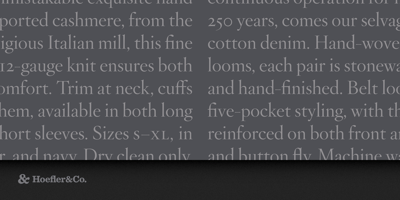
Hoefler Titling Font Family was designed by Jonathan Hoefler and published by Hoefler & Co.. Hoefler Titling contains 6 styles and family package options. A family of energetic display faces in the baroque style, Hoefler Titling is the display-size counterpart to Hoefler Text. The Hoefler Titling typeface was designed by Jonathan Hoefler in 1994. A family of elegant display faces in the baroque style, Hoefler Titling shares many mannerisms with the various ‘Garamond’ typefaces of the early twentieth century — nearly all of which revive not the types of sixteenth century punchcutter Claude Garamond, but those of seventeenth century typefounder Jean Jannon. Hoefler Titling was created for House & Garden magazine, in whose pages the typeface first appeared in 1996. From the desk of the designer: As its name suggests, Hoefler Text was designed to be used in text sizes. For Hoefler Titling, this display-size cousin, we decided not to adapt Hoefler Text’s design, but instead to create an entirely new family of typefaces that would be sympathetic with Hoefler Text without aping its mannerisms. This sort of equivocal relationship between text and display faces has a long tradition in typefounding: excellent modern examples are Hermann Zapf’s Palatino (1948) and Michelangelo (1950), and Matthew Carter’s Galliard (1978) and Mantinia (1993). Like Hoefler Text, the style of Hoefler Titling reveals its designer’s affection for two beloved text faces — fonts that coincidentally share the same unusual secret. One inspiration for Hoefler Text’s roman was Janson Text (1932), Chauncey Griffith’s sober text face that revives the types thought to be made by Dutch punchcutter Anton Janson (1620-1687), but later discovered to be the work of the Hungarian Miklós Kis (1650-1702). The italics of both Hoefler Text and Hoefler Titling show strains of Morris Fuller Benton’s Garamond No. 3 (1936), which is modeled on typefaces originally indentified with Claude Garamond (c. 1490-1561), but later proven to be the work of Jean Jannon (1580-1658). With this in mind, Hoefler Titling is more a gloss on the baroque style than the revival of any one historical typeface, and as such it freely explores territory unknown to either typefounder. The family includes three weights, each outfitted with romans, italics, small caps and swashes.