ID , 'designer' ); if (!empty($terms) && !is_wp_error($terms)) { foreach ( $terms as $term ) { $term_link = get_term_link( $term, 'designer' ); echo "Designer: " . $term->name . ""; } } ?>
ID ) ) . ' font" class="img-fluid">'; } ?>
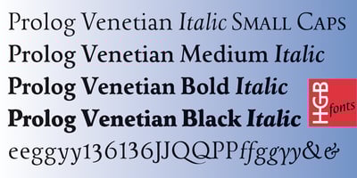
Prolog Venetian Font Family was designed by Hellmut G. Bomm and published by HGB fonts. Prolog Venetian contains 8 styles and family package options. Prolog Venetian is part of an extended font family. Based on Giovanni Francesco Cresci’s font samples from 1570, I drew a Medieval (Old Style) called Prolog Venetian. Following Cresci’s formal principle, a transitional antiqua (Prologue Barock), a classicist antiqua (Prolog Modern) and a slab serif followed. Then I added a sans-serif and a hybrid antiqua. Prolog Venetian has a slanted (Venetian) e in addition to a straight e. Additional variants (table numerals, Old Style Figures, and alternatives of Q-P-g-y) are available via OpenType functions. All Prolog fonts are designed for quantity typesetting. The typeface is pleasantly readable in small gradations and yet independent. A wonderful alternative to the usual text fonts.