ID , 'designer' ); if (!empty($terms) && !is_wp_error($terms)) { foreach ( $terms as $term ) { $term_link = get_term_link( $term, 'designer' ); echo "Designer: " . $term->name . ""; } } ?>
ID ) ) . ' font" class="img-fluid">'; } ?>
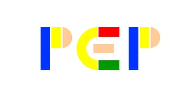
Pep Font Family was designed by Dries Wiewauters and published by Studio Dries Wiewauters. Pep contains 14 styles and family package options. Pep has a lot of pep. It is loosely based on a series of experimental designs ranging from Fregio Mecano and Futura Schmuck in the 1920s to Bruno Munari’s ABC Con Fantasia in the 1960s. Whilst the UPPERCASE of Pep can be traced back to the latter, the entire typeface takes the six geometric elements much further. Throughout the design process, designer Dries Wiewauters tried to find the extremes within said “rules”. This process resulted in a mixed case type system, even extending into experimental Cyrillic and Greek lettering. Pep is a typeface that can easily add playful flair, but also balances with restraint and confidence. Experiment with colors! Stylistic alternates! Break the forms! But, apply and utilize playfully at all times. In the words of Devo: Vigor, vim, vitality and punch The ability to act on a sudden hunch Nerve to tackle the hardest thing Feet that climb and hands that cling A heart that never forgets to sing That’s Pep © Devo, Mark Mothersbaugh, 1980
