ID , 'designer' ); if (!empty($terms) && !is_wp_error($terms)) { foreach ( $terms as $term ) { $term_link = get_term_link( $term, 'designer' ); echo "Designer: " . $term->name . ""; } } ?>
ID ) ) . ' font" class="img-fluid">'; } ?>
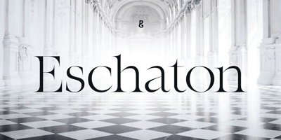
Eschaton Font Family was designed by Paulo Goode and published by Paulo Goode. Eschaton contains 36 styles and family package options. Eschaton is an exquisite transitional typeface whose delicate, high-contrast style exudes confidence – delivering your message with composure and clarity. This 36-font type family has a purposeful, contemporary stance that excels on screen and in print by way of its three optical sizes.Eschaton’s elegantly clean and simple forms allow your text, your headlines, your message to stand proud and be heard – finding a moment of clarity in today’s world of continual visual bombardment.Eschaton is a refined display typeface in its standard form, the full family includes Text (lower contrast) and Xtra (extreme contrast) optical sizes to cater for further typographic demands. Weights range from light to black in both roman and italic styles. The default figure type is set to old-style, however, proportional figures are just a click away if you prefer. Eschaton has an extensive character set that covers all Latin European languages.NEW Looking for the perfect pairing for Eschaton? Then please take a look at Immanent, which has been designed with the same proportions and range of weights and optical sizes as Eschaton.See full details and hi-res examples at https://paulogoode.com/eschatonKey Features• Six Weights• Roman & Italic• Three Optical Sizes• 450+ Glyphs
