ID , 'designer' ); if (!empty($terms) && !is_wp_error($terms)) { foreach ( $terms as $term ) { $term_link = get_term_link( $term, 'designer' ); echo "Designer: " . $term->name . ""; } } ?>
ID ) ) . ' font" class="img-fluid">'; } ?>
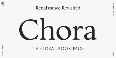
APN Chora Font Family was designed by Patrick Nell and published by Alphabets Patrick Nell. APN Chora contains 2 styles and family package options. APN Chora is a contemporary humanist typeface expertly crafted for optimal legibility in books and editorial design, as well as for extended reading on screens. Available in only two styles—roman and italic—both finely tuned to each other and fully equipped for all needs of refined typography.APN Chora offers small caps, ligatures, multiple figure and stylistic sets, alternative glyphs, fractions, mathematical symbols, and arrows. It supports a wide range of languages, including all European languages written in the Latin script. With its rationalized Renaissance construction, the typeface features a pronounced humanist axis, generous x-height, and balanced contrast between thin and thick strokes. While optimized for extended reading, its austere elegance also suits display use.A Humanist TypefaceAmong the most legible letterforms in typography, old-style typefaces also stand as some of the earliest designs. Emerging in the second half of the 1400s, Venetian printers crafted types that abandoned Gutenberg’s dense blackletter approach, drawing instead upon the flowing Renaissance calligraphy for their minuscules and the timeless grandeur of the roman imperial inscriptions for their capitals.APN Chora is inspired by this typographic heritage without directly referencing any single historical model. It is a contemporary humanist roman with an accompanying italic, capturing Venetian, Aldine, and Dutch characteristics, further rationalized and interpreted from a 21st-century perspective.A Leitmotiv in the development of APN Chora was the idea of the cyclical, the recurring—the Chorus. This principle is particularly evident to the Viennese type designer, especially through the surrounding architecture of this city. The Renaissance reflected on ancient forms and ideals, and these classical ideals were later revisited and reinterpreted by movements such as Classicism, Historicism (with its Neo-Renaissance style), and, later still, Neoclassicism, often with blurred transitions between them. APN Chora is conceived as an imagined Renaissance typeface, one that could only have been envisioned through the lens of these recurring cycles of influence, so prevalent in both type design and the broader history of art.A Book Typeface—and moreThe working title of APN Chora was Wiener Buchschrift, which translates to Viennese Book Typeface. In keeping with this original concept APN Chora is available in only two styles: the roman and the italic. Both are finely tuned to each other and optimized for use in typical sizes for long-form texts, especially in books, prioritizing legibility with an even, sufficiently dark color and clear, open letterforms, free from any flickering—both on paper and on screen.As with many of its historical inspirations, there are no bold or condensed styles, nor other variations. Instead, typographic contrast can be achieved through the skillful use of the italic, small caps, and, for titling, the inscriptional capitals of APN Chora, with their distinctive Trajanic rhythm of narrow and wide letters–and a beautifully round ‘O’.APN Chora strives to be the most legible of elegant typefaces, and the most elegant of legible typefaces. Consequently, it includes everything you will need for fine book typography. There are small caps, a fine set of (rare) ligatures, multiple figure and stylistic sets, alternative glyphs, fractions, mathematical symbols, and arrows. APN Chora supports a wide range of languages, including all European languages using the Latin script, and offers extensive OpenType features.Among its stylistic sets and alternative forms you will find variants that allow for different flavors and applications. For example, there are capitals with increased width for instances when the traditional Roman proportions don’t fit the context. Or there is an ‘e’ with an angled crossbar to emphasize the humanist element. And, on the other hand, there is an ‘M’ in the style of Francesco Griffo, with a single upper serif, to accentuate the Aldine influence.APN Chora is primarily a book typeface, but it is thoroughly designed, and its inherent qualities do shine in larger sizes. So try APN Chora as a display face for headlines or posters, you will be in for a treat.A Refined TypefaceStylistically, APN Chora is a rationalized old-style typeface, rather than following a transitional or modern model. APN Chora displays an almost geometric regularity, yet it is drawn with grace and possesses enough peculiarities and idiosyncrasies to keep it alive and interesting.Its capitals maintain the distinctive classical proportions and rhythm of narrow and wide letters, with a sculpted round ‘O’ and bracketed serifs that give a column-like appearance, while the minuscules possess angled, calligraphy-influenced head serifs. The lowercase curves exhibit an angular transition int

