ID , 'designer' ); if (!empty($terms) && !is_wp_error($terms)) { foreach ( $terms as $term ) { $term_link = get_term_link( $term, 'designer' ); echo "Designer: " . $term->name . ""; } } ?>
ID ) ) . ' font" class="img-fluid">'; } ?>
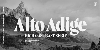
Alto Adige Font Family was designed by Emil Karl Bertell and published by Fenotype. Alto Adige contains 1 styles and family package options. Named after Italy’s northernmost region, Alto Adige is a high-contrast display serif typeface. With its condensed width and bold contrast it is excellent for headlines, packaging, magazines, posters and advertising, among any other display use. Alto Adige has large x-height making it a steady choice for sturdy text blocks with tight leading. In large sizes, you can also try tighter tracking for maximum impact. Alto Adige comes with a set of OpenType features: Contextual Alternates and Standard Ligatures are automatically on for certain character pairs. In addition it has over 50 alternates for display capital initials, set in Swash, Stylistic and Titling Alternates.