ID , 'designer' ); if (!empty($terms) && !is_wp_error($terms)) { foreach ( $terms as $term ) { $term_link = get_term_link( $term, 'designer' ); echo "Designer: " . $term->name . ""; } } ?>
ID ) ) . ' font" class="img-fluid">'; } ?>
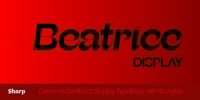
Beatrice Display Font Family was designed by Lucas Sharp, Inga Plönnigs, Connor Davenport, Kia Tasbihgou and published by Monotype. Beatrice Display contains 16 styles and family package options. Beatrice is a new kind of typeface. This collection of fonts is an exploration of a range of contrast methodologies, combining various aspects from the canon expansionist systems, inverted contrast, and the contrast behavior of grotesks. These methodologies were dissected and used as cornerstones in creating our own system. When it was first released in 2018, Beatrice landed in largely unexplored territory in type design, and the bar it set remains today. Built upon the foundation of the American Gothic and utilizing tight-not-touching spacing, the Beatrice families feature a robust set of weights across four optical sizes including Standard, Deck, Headline, and Display. The iconic cut of Beatrice Display offers the highest head-turning contrast; where Beatrice Standardis best for all high-function-low-contrast needs; Headline and Deck, were drawn to smoothly click into place between the original two sizes, offering a more gradual spectrum of applications.Beatrice Display is the family flagship. It’s a visual oddity, instantly indelible, and a striking example of the Internal Contrast methodology. In addition to its notably high contrast, the extremely cozy spacing, finely wrought apertures, and dramatic hairlines lend the Display an exuberance that almost lifts it off the page. Because the details demand to be seen, we don’t recommend using Beatrice Display at point sizes below 60pt.