ID , 'designer' ); if (!empty($terms) && !is_wp_error($terms)) { foreach ( $terms as $term ) { $term_link = get_term_link( $term, 'designer' ); echo "Designer: " . $term->name . ""; } } ?>
ID ) ) . ' font" class="img-fluid">'; } ?>
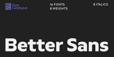
Better Sans Font Family was designed by Luciano Vergara, Jorge Cisterna, Daniel Hernández, Felipe Sanzana and published by Font Catalogue. Better Sans contains 16 styles and family package options. Stability and precision with a hint of familiarity Better Sans is like that reliable friend who always makes your designs shine. Its familiar components make it easy to work with and feel like a companion you’ve teamed up with repeatedly. As a sans-serif font, Better Sans combines efficiency with a friendly, approachable feel, making it ideal for vibrant branding and engaging advertisements. It cleverly integrates geometric shapes while maintaining warmth and an appealing aesthetic, enhancing specific characters and adding a playful touch. Round, compact shapes and standout characters give words a distinctive identity. With a perfect range of weights available, Better Sans offers versatility for branding applications, whether designing headlines for innovative apps and websites or using it in traditional formats. Its horizontal alignment provides stability against any background, making it ideal for web downloads and catchy advertising slogans. It is an excellent choice for technology brands looking to create a lasting impression.