Download
ID , 'foundry' );
if (!empty($terms) && !is_wp_error($terms)) {
foreach ( $terms as $term ) {
$term_link = get_term_link( $term, 'foundry' );
echo "Publisher: " . $term->name . "";
} } ?>
ID , 'designer' ); if (!empty($terms) && !is_wp_error($terms)) { foreach ( $terms as $term ) { $term_link = get_term_link( $term, 'designer' ); echo "Designer: " . $term->name . ""; } } ?>
ID ) ) . ' font" class="img-fluid">'; } ?>
ID , 'designer' ); if (!empty($terms) && !is_wp_error($terms)) { foreach ( $terms as $term ) { $term_link = get_term_link( $term, 'designer' ); echo "Designer: " . $term->name . ""; } } ?>
User Rating: Be the first one!
ID ) ) . ' font" class="img-fluid">'; } ?>
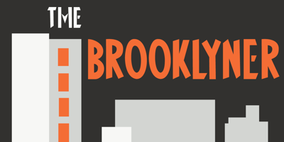
Brooklyner Font Family was designed by David Kerkhoff and published by Hanoded. Brooklyner contains 2 styles and family package options. Brooklyner font is based on the typeface used for The Brooklynite, a magazine which saw its heyday in the 1920’s. The typeface before you is an all caps affair, making it a perfect choice for headlines, posters and ads. Since I had to work with just a handful of glyphs (11 to be precise), it took me a while to design the rest. Brooklyner font is loose, cartoonesque and very legible – and it comes with extensive language support.