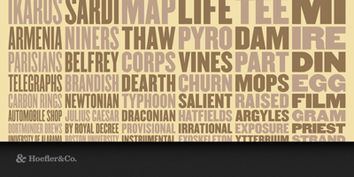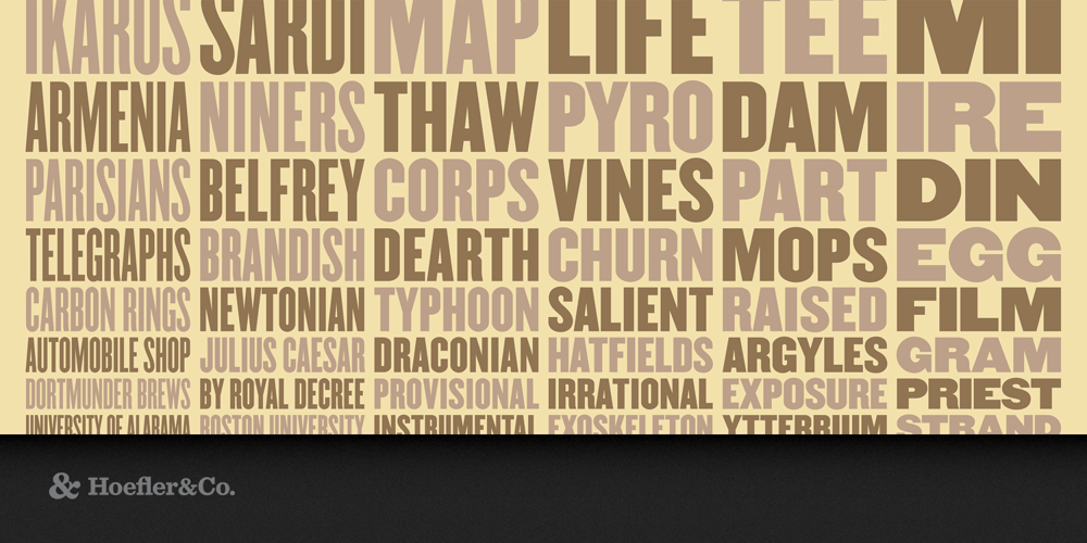
Champion Gothic Font Family was designed by Jonathan Hoefler and published by Hoefler & Co.. Champion Gothic contains 6 styles and family package options. Bucking the traditional arrangement of condensed, normal and wide, Champion Gothic uses a nineteenth century idea to help solve a twenty-first century problem. The Champion Gothic typeface was designed by Jonathan Hoefler in 1991. A collection of six sans serifs related by width instead of weight, Champion was inspired by the sundry American wood types that were once used indiscriminately by nineteenth century poster printers, creating the riotous aesthetic that is identified with Americana. Champion Gothic was created for Sports Illustrated, in whose pages the typeface first appeared in 1991. A classic American headline series. American woodtypes of the late nineteenth century served as the inspiration for Champion Gothic, in both form and philosophy. Before the modern idea of the rational type family, in which a central design is reshaped to make different weights and widths, woodtype makers produced typefaces “in series,” collecting visually related designs together under the same name. Unlike a type family, fonts produced in series usually had no central design, a practice that Champion follows. As a result, each of Champion’s six styles feels like the normal width.