ID , 'designer' ); if (!empty($terms) && !is_wp_error($terms)) { foreach ( $terms as $term ) { $term_link = get_term_link( $term, 'designer' ); echo "Designer: " . $term->name . ""; } } ?>
ID ) ) . ' font" class="img-fluid">'; } ?>
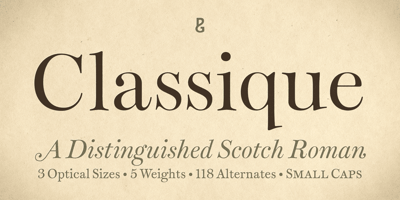
Classique Font Family was designed by Paulo Goode and published by Paulo Goode. Classique contains 30 styles and family package options. Classique is a distinguished Scotch-style serif that was inspired by a single-page type sample from c.1785 entitled “Eliz. Caslon’s New Pica”. This high-contrast serif face captivated me and I have wanted to reproduce its beauty for some time. So, here it is! Classique Regular and Italic are reasonably accurate interpretations of that sample and I have taken the liberty of expanding upon them to create a family of 30 fonts.Classique has been drawn with a loose style to retain the warmth and personality of its 18th century origins. Serifs are soft, horizontals and verticals are pinched and often irregular, joints and inktraps arch with imprecision… each glyph has a charm of its own. Undoubtedly, Classique is one of the most distinctive Scotch Romans you will find.There are three optical sizes and five weights in both roman and italic styles. Text weights are perfect for body copy and small text sizes, while Display weights should be used at very large sizes–perfect for titles, headlines and branding purposes. This gives Classique great versatility and I am sure you will love how it performs in your next typographic project.Activate stylistic sets and you will get access to over one hundred sumptuous alternates that will add flourishes of finesse to your titles and headlines. Classique has a character set that covers all Latin European languages.See full details and hi-res examples at paulogoode.com/classiqueKEY FEATURES• Five Weights• Roman & Italic• Three Optical Sizes• Small Caps• 118 Alternates• 750 Glyphs