Download
ID , 'foundry' );
if (!empty($terms) && !is_wp_error($terms)) {
foreach ( $terms as $term ) {
$term_link = get_term_link( $term, 'foundry' );
echo "Publisher: " . $term->name . "";
} } ?>
ID , 'designer' ); if (!empty($terms) && !is_wp_error($terms)) { foreach ( $terms as $term ) { $term_link = get_term_link( $term, 'designer' ); echo "Designer: " . $term->name . ""; } } ?>
ID ) ) . ' font" class="img-fluid">'; } ?>
ID , 'designer' ); if (!empty($terms) && !is_wp_error($terms)) { foreach ( $terms as $term ) { $term_link = get_term_link( $term, 'designer' ); echo "Designer: " . $term->name . ""; } } ?>
User Rating: Be the first one!
ID ) ) . ' font" class="img-fluid">'; } ?>
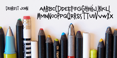
Dearest John Font Family was designed by published by Outside the Line. Dearest John contains 1 styles and family package options. Dearest John is the first font in the Love Letters series from Outside the Line. It is a bouncy hand lettered font. If you type caps and lower case you get one look. If you type all caps you get another look. Kind of 2 fonts for the price of one. I prefer to type caps and lower case and then go back in and tweak the headline a little to get the look I want. Dearest John was seen in the 2011 Typodarium Page-A-Day Calendar on 12-9-2011.