ID , 'designer' ); if (!empty($terms) && !is_wp_error($terms)) { foreach ( $terms as $term ) { $term_link = get_term_link( $term, 'designer' ); echo "Designer: " . $term->name . ""; } } ?>
ID ) ) . ' font" class="img-fluid">'; } ?>
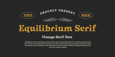
Equilibrium Serif Font Family was designed by Måns Grebäck and published by Mans Greback. Equilibrium Serif contains 4 styles and family package options. Equilibrium Serif strikes a harmonious balance between bold authority and soft elegance. Its classic serif forms are rooted in tradition, but the rounded edges and subtle softness give it a contemporary, approachable feel. Each letterform is robust yet fluid, exuding a sense of calm strength.The font’s neo-classic design evokes timelessness, while the glow of its smooth curves adds a warm, inviting touch. Equilibrium Serif is versatile, lending itself to both formal and modern contexts, making it perfect for projects that require a refined yet understated charm.The font is built with advanced OpenType functionality and guaranteed top-notch quality, containing stylistic and contextual alternates, ligatures, and more automatic and manual features; all to give you full control and customizability. It has extensive lingual support, covering all Latin-based languages, from North Europa to South Africa, from America to South-East Asia. It contains all characters and symbols you’ll ever need, including all punctuation and numbers.Designed by Mans Greback, Equilibrium Serif reflects his commitment to blending classic design principles with modern aesthetics, creating a font that feels both timeless and fresh.