Download
ID , 'foundry' );
if (!empty($terms) && !is_wp_error($terms)) {
foreach ( $terms as $term ) {
$term_link = get_term_link( $term, 'foundry' );
echo "Publisher: " . $term->name . "";
} } ?>
ID , 'designer' ); if (!empty($terms) && !is_wp_error($terms)) { foreach ( $terms as $term ) { $term_link = get_term_link( $term, 'designer' ); echo "Designer: " . $term->name . ""; } } ?>
ID ) ) . ' font" class="img-fluid">'; } ?>
ID , 'designer' ); if (!empty($terms) && !is_wp_error($terms)) { foreach ( $terms as $term ) { $term_link = get_term_link( $term, 'designer' ); echo "Designer: " . $term->name . ""; } } ?>
User Rating: Be the first one!
ID ) ) . ' font" class="img-fluid">'; } ?>
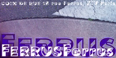
Ferrus Font Family was designed by Gert Wiescher and published by Wiescher Design. Ferrus contains 4 styles and family package options. Ferrus is named after the location of famous French foundry Deberny & Peignot which was at 18 Rue Ferrus, XIV Paris. Ferrus is inspired by a 1920s font named “Acier”. But Ferrus is not a revival or copy of that font, it is a new design based on a strong black and white contrast in 45 degrees, which gives the font a fake three-dimensional character. I made two cuts, a plain bold one and a Smallcaps version, like this you get two fonts for a fair price. Your font designer for strong contrasts, Gert Wiescher