Download
ID , 'foundry' );
if (!empty($terms) && !is_wp_error($terms)) {
foreach ( $terms as $term ) {
$term_link = get_term_link( $term, 'foundry' );
echo "Publisher: " . $term->name . "";
} } ?>
ID , 'designer' ); if (!empty($terms) && !is_wp_error($terms)) { foreach ( $terms as $term ) { $term_link = get_term_link( $term, 'designer' ); echo "Designer: " . $term->name . ""; } } ?>
ID ) ) . ' font" class="img-fluid">'; } ?>
ID , 'designer' ); if (!empty($terms) && !is_wp_error($terms)) { foreach ( $terms as $term ) { $term_link = get_term_link( $term, 'designer' ); echo "Designer: " . $term->name . ""; } } ?>
User Rating: Be the first one!
ID ) ) . ' font" class="img-fluid">'; } ?>
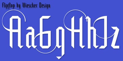
Flipflop Font Family was designed by Gert Wiescher and published by Wiescher Design. Flipflop contains 3 styles and family package options. This font makes the impression to be a blackletter font (Fraktur) but it really only is little squares and triangles stuck together in a flip or flop way to form the glyphs. Only a few times did I have to leave this system – like for the degree or brève glyphs. In order to make this experiment somehow useful, I added a set with swings on the capitals. I think it all looks very good and can easily be used like a blackletter. Your strange typedesigner Gert Wiescher