ID , 'designer' ); if (!empty($terms) && !is_wp_error($terms)) { foreach ( $terms as $term ) { $term_link = get_term_link( $term, 'designer' ); echo "Designer: " . $term->name . ""; } } ?>
ID ) ) . ' font" class="img-fluid">'; } ?>
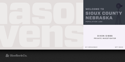
Forza Font Family was designed by Jonathan Hoefler and published by Hoefler & Co.. Forza contains 12 styles and family package options. Succinct geometries make for an expressive type family that’s ardent, disciplined, shrewd, and commanding. The Forza typeface was designed by Jonathan Hoefler in 2006. A sans serif adaptation of Hoefler’s Vitesse typeface (2000), the central motif of both typefaces is a soft-cornered barrel shape, which affords opportunities for both long straightaways and quick turns. Forza was created for Wired magazine, in whose pages the typeface first appeared in 2006. Forza. Articulate meets assertive. Some of the world’s most complex typography can be found in magazines. Their formal requirements are daunting — even the simplest magazine includes listings, tables, complex navigation systems, and painterly display typography — but even more daunting are the multitude of editorial voices that they require. A title such as Wired might take “technology” as its theme, but it covers technological topics from cultural, political, commercial, social, and philosophical perspectives. Science requires a different voice than science fiction, as do lofty prognostications and down-to-earth service pieces. The title that includes all of these needs an especially acrobatic family of fonts.