Scriptofino

Scriptofino Font Family was designed by Gert Wiescher and published by Wiescher Design. Scriptofino contains 4 styles and family package options. Scriptofino is a very fine and elegant script with ...
Scriptofino Font Family was designed by Gert Wiescher and published by Wiescher Design. Scriptofino contains 4 styles and family package options. Scriptofino is a very fine and elegant script with ...

Fleuron Labels Font Family was designed by Gert Wiescher and published by Wiescher Design. Fleuron Labels contains 1 styles and family package options. Fleurons are embellishments and here is my ...
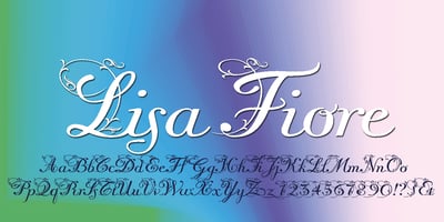
Lisa Fiore Font Family was designed by Gert Wiescher and published by Wiescher Design. Lisa Fiore contains 1 styles and family package options. Lisa is an elegant script family in the tradition of ...
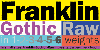
Franklin Gothic Raw Font Family was designed by Gert Wiescher and published by Wiescher Design. Franklin Gothic Raw contains 10 styles and family package options. When drawing a new font, there is a ...

Cosma Font Family was designed by Gert Wiescher and published by Wiescher Design. Cosma contains 56 styles and family package options. »COSMA« is an old greek word that stands for »beauty« and ...
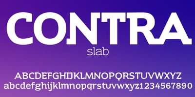
Contra Slab Font Family was designed by Gert Wiescher and published by Wiescher Design. Contra Slab contains 10 styles and family package options. Contra Sans is the slab serif version of my Contra ...
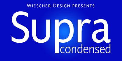
Supra Condensed Font Family was designed by Gert Wiescher and published by Wiescher Design. Supra Condensed contains 16 styles and family package options. »Supra-condensed« – designed by Gert ...
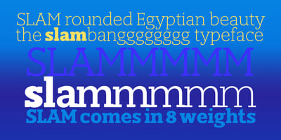
Slam Rounded Font Family was designed by Gert Wiescher and published by Wiescher Design. Slam Rounded contains 16 styles and family package options. »SLAM« is my new, very sturdy but elegant ...

Alpha Delta Font Family was designed by Gert Wiescher and published by Wiescher Design. Alpha Delta contains 3 styles and family package options. The standard paperclip is the basic idea behind this ...
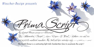
Prima Script Font Family was designed by Gert Wiescher and published by Wiescher Design. Prima Script contains 4 styles and family package options. »Prima Script« was designed especially for use in ...