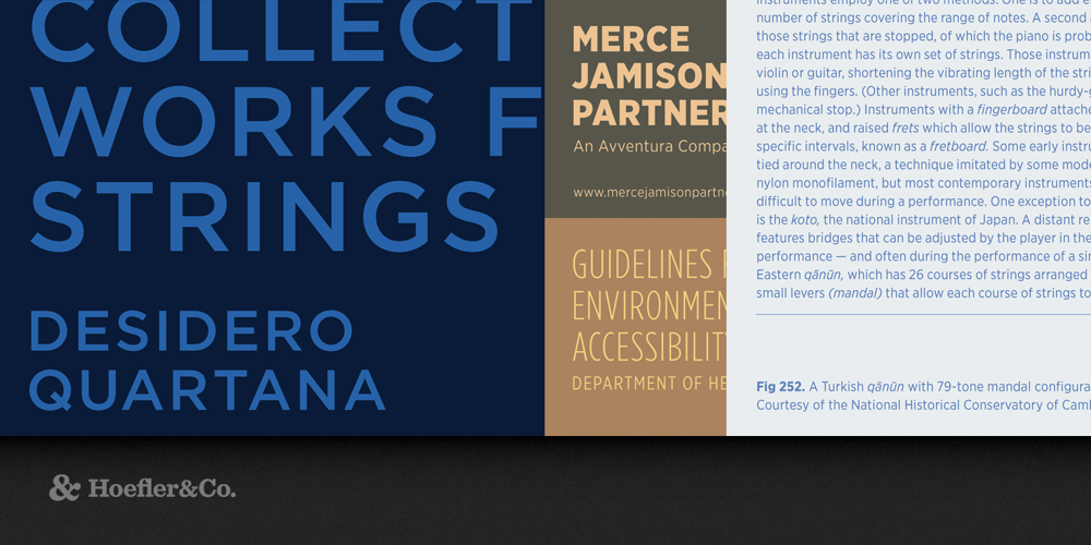
Gotham Font Family was designed by Jonathan Hoefler and Tobias Frere-Jones and published by Hoefler & Co.. Gotham contains 206 styles and family package options. Every designer has admired the no-nonsense lettering of the American vernacular, those letters of paint, plaster, neon, glass and steel that figure so prominently in the urban landscape. From these humble beginnings came Gotham, a hard-working typeface for the ages. The Gotham typeface was designed by Jonathan Hoefler and Tobias Frere-Jones in 2000. A sans serif that shares many attributes of typography’s ‘geometric’ genus, Gotham was inspired by a style of bold capital letters that evolved outside the typographic tradition in the early twentieth century, common to lithographed posters, enamel signs, and commercial facades throughout New York City. First appearing in the pages of GQ magazine in 2001, Gotham gained international attention in 2007 when it was adopted by the presidential campaign of Barack Obama. One of the most popular and influential typefaces of our time, Gotham is in the permanent collection of the Museum of Modern Art in New York. From the desk of the designer: Gotham celebrates the attractive and unassuming lettering of the city. New York is teeming with such letters, handmade sans serifs that share a common underlying structure, an engineer’s idea of “basic lettering” that transcends both the characteristics of their materials and the mannerisms of their makers. These are the cast bronze numbers that give office doorways their authority, and the markings on cornerstones whose neutral and equable style defies the passage of time. They’re the matter-of-fact neon signs that emblazon liquor stores and pharmacies, and the names of proprietors plainly painted on delivery trucks. These letters are straightforward and non-negotiable, yet possessed of great personality, and often expertly made. And although designers have lived with them for more than half a century, they remarkably went unrevived until 2000, when we introduced Gotham. Gotham is that rarest of designs, the new typeface that feels somehow familiar. From the lettering that inspired it, Gotham inherited an honest tone that’s assertive but never imposing, friendly but never folksy, confident but never aloof. The inclusion of so many original ingredients without historical precedent — a lowercase, italics, a comprehensive range of weights and widths, and a character set that transcends the Latin alphabet — enhances these forms’ plainspokenness with a welcome sophistication, and brings a broad range of expressive voices to the Gotham family. Four Widths Designers asked if Gotham could take on new typographic roles, and we listened. Gotham Narrow reimagines Gotham as a space-efficient text face, handily succeeding in the confines of the narrow text column without looking squeezed. With the silhouette of a classic headline series, Gotham Extra Narrow is a practical choice for sizes both large and small, with an ample character set that recommends it to information-dense environments. Gotham Condensed features nine weights from Thin to Ultra, including a number of features unusual in condensed fonts, starting with matching italics in every weight.Featured in: Best Fonts for Logos, Best Fonts for Websites, Best Fonts for PowerPoints
