Download
ID , 'foundry' );
if (!empty($terms) && !is_wp_error($terms)) {
foreach ( $terms as $term ) {
$term_link = get_term_link( $term, 'foundry' );
echo "Publisher: " . $term->name . "";
} } ?>
ID , 'designer' ); if (!empty($terms) && !is_wp_error($terms)) { foreach ( $terms as $term ) { $term_link = get_term_link( $term, 'designer' ); echo "Designer: " . $term->name . ""; } } ?>
ID ) ) . ' font" class="img-fluid">'; } ?>
ID , 'designer' ); if (!empty($terms) && !is_wp_error($terms)) { foreach ( $terms as $term ) { $term_link = get_term_link( $term, 'designer' ); echo "Designer: " . $term->name . ""; } } ?>
User Rating: Be the first one!
ID ) ) . ' font" class="img-fluid">'; } ?>
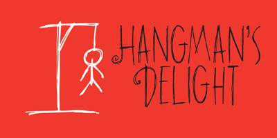
Hangman’s Delight Font Family was designed by David Kerkhoff and published by Hanoded. Hangman’s Delight contains 1 styles and family package options. Hangman’s Delight is a scratchy, all caps font. The upper case letters come with swirls and curls, but the lower case letters are unadorned. A bit of an unusual font, I admit, but it would look nice on book covers and posters. Comes with some ligatures and stylistic alternates and a whole bunch of diacritics.