ID , 'designer' ); if (!empty($terms) && !is_wp_error($terms)) { foreach ( $terms as $term ) { $term_link = get_term_link( $term, 'designer' ); echo "Designer: " . $term->name . ""; } } ?>
ID ) ) . ' font" class="img-fluid">'; } ?>
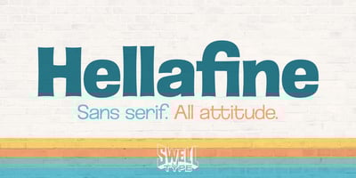
Hellafine Font Family was designed by John Roshell and published by Swell Type. Hellafine contains 15 styles and family package options. At first glance, Hellafine may look like that certain Swiss sans-serif font you know so well, with its subtle thick/thin contrast and squarish circles.But no. This is the way we WISH that font looked. With tight spacing. With groovy, loopy fs and ts. With an UltraBold that’s actually Ultra Bold.Inspired by painted street signs in the San Francisco Bay Area in the ’70s and ’80s. Hellafine’s letters look like they were painted three feet tall on a brick wall from memory, not while looking at a boring type spec book. The edges and ends have that lovely flaring sign painters use to make tight, sharp corners, and letters that are readable from across Market Street through pea-soup fog.That ain’t enough for ya? Hellafine has hella options:You want it more “normal” for the front of corporate headquarters? Fine, switch to Stylistic Set One. You want a little extra flair, like our sign painter took a bong hit to fight off a hangover? Hit up Set Two. You want an all-inclusive Unicase to let your freak flag fly? We got you with Set Three. Whichever way you use it, Hellafine brings hella attitude.