ID , 'designer' ); if (!empty($terms) && !is_wp_error($terms)) { foreach ( $terms as $term ) { $term_link = get_term_link( $term, 'designer' ); echo "Designer: " . $term->name . ""; } } ?>
ID ) ) . ' font" class="img-fluid">'; } ?>
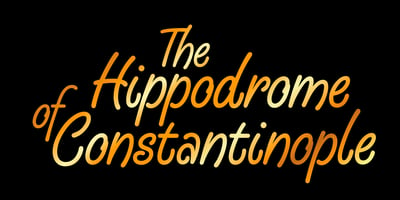
Hippodrome Font Family was designed by Alan Meeks and published by Alan Meeks. Hippodrome contains 2 styles and family package options. It is often difficult to say what inspired a font but in the case of Hippodrome it was easybecause it is the lower case “w”. I used the “w” in a logo design that went no further but I thought ‘I can’t waste that”w”’. Fortunately the v,y and u were happy to go along with this designand the rest of the font had to work around them. The caps and the rest of the characters fell into place comfortably and I ended up with a casual script typeface that flowed reallywell and that I was really pleased with.Hippodrome comes in a pro latin font in two weights. Enjoy…
