ID , 'designer' ); if (!empty($terms) && !is_wp_error($terms)) { foreach ( $terms as $term ) { $term_link = get_term_link( $term, 'designer' ); echo "Designer: " . $term->name . ""; } } ?>
ID ) ) . ' font" class="img-fluid">'; } ?>
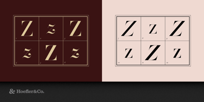
HTF Didot Font Family was designed by Jonathan Hoefler and published by Hoefler & Co.. HTF Didot contains 42 styles and family package options. Created for “one of the most dramatic magazine reinventions in history,” HTF Didot honors a heroic period in French typographic history. The HTF Didot typeface was designed by Jonathan Hoefler in 1991. A design in the ‘modern’ genus, whose rationality and precision suggests engineering rather than penmanship, HTF Didot pays homage to the French neoclassical typefounder Firmin Didot (1764–1836) whose work epitomizes the style. Designed for Harper’s Bazaar, in whose pages the typeface first appeared in September 1992, HTF Didot was one of the first digital typefaces designed with a schedule of ‘optical sizes’ that preserve the fonts’ delicate hairlines at any size. HTF Didot is in the permanent collection of the Museum of Modern Art in New York. From the desk of the designer: Modern typefaces, characterized by consistently horizontal stress, flat and unbracketed serifs, and a high contrast between thin and thick strokes, were the final step in typography’s two-hundred-year journey away from calligraphy. In the late eighteenth century the style was perfected, and became forever associated with two typographic giants: in Parma, Giambattista Bodoni (1740-1813), and in Paris, Firmin Didot (1764-1836). Didot was a member of the Parisian dynasty that dominated French typefounding for two centuries, and he’s remembered today as the namesake of a series of Neoclassical typefaces that exquisitely captured the Modern style. It is these typefaces that HTF Didot revives. We designed these faces in 1991, as part of the new Harper’s Bazaar that was being conceptualized by Liz Tilberis and Fabien Baron. The brief was just the kind of challenge that Hoefler&Co loves: we were asked to create a typeface that works like no other, a Modern which — unlike the commercial cuts of Bodoni — would have hairline serifs, and maintain them over a range of sizes. From the Didot collection we chose the grosse sans pareille no. 206 of Molé le jeune as a historical model, and extended the scant material in Didot’s 1819 Spécimen des Caractereswith quite a bit of invention: italics designed to work at large sizes, a range of different weights, and the many characters that Didot’s workshop never made. In the service of the design’s thin hairlines, we drew each of the family’s six styles in seven different “optical sizes,” each designed to be used at a different range of sizes, for a total of forty-two fonts. Harper’s Bazaar would become a milestone in fashion publishing, its typeface singled out by the American Society of Magazine Editors (ASME) as part of “one of the most dramatic magazine reinventions in history.” The HTF Didot typefaces continue to be a major part of the most fashionable brands, including Bazaar itself — a testament to the flexibility and durability of the style.