ID , 'designer' ); if (!empty($terms) && !is_wp_error($terms)) { foreach ( $terms as $term ) { $term_link = get_term_link( $term, 'designer' ); echo "Designer: " . $term->name . ""; } } ?>
ID ) ) . ' font" class="img-fluid">'; } ?>
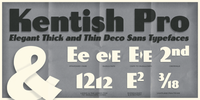
Kentish AOE Pro Font Family was designed by Brian J. Bonislawsky and published by Astigmatic. Kentish AOE Pro contains 3 styles and family package options. An elegant pairing of thick and thin sans-serif upright and italic types, Kentish AOE Pro’s letterforms walk a line between deco style and vintage wood types. Originating as a revival and elaboration of a limited lettering specimen from a series of old loose spanish specimen book pages. What began as just Capitals, Lowercase and Numerals was expanded to a rich pro glyphset including punctuation, small caps, small caps scaled figures, unlimited fractionals, superiors & inferiors, ordinals, tabular & proportional figures, and an expanded language glyph set. From historical harkenings to modern letterpress, book covers, headlines, or anything else you want to give a dash of indescribable authenticity to, Kentish AOE Pro is here to fill your need with Regular & Italic styles bundled together at a single price.