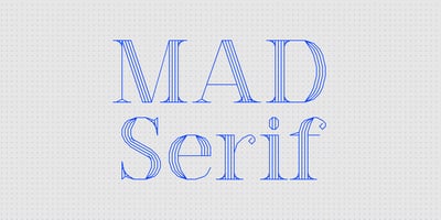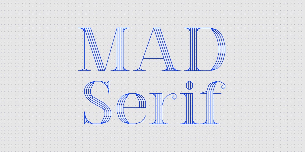
MAD Serif Font Family was designed by Dries Wiewauters and published by Studio Dries Wiewauters. MAD Serif contains 8 styles and family package options. MAD Serif is the more elegant side to the MAD family, with a similar harshness to MAD Sans but with a shape that is more graceful and features that become sharper and delicate at points. Like MAD Sans, an initial rough first appearance makes way for a balanced and sophisticated typefamily, ready for use in different sizes to give flair to headlines and an interesting texture to body copy. Designer Dries Wiewauters fascination for the typography programmed in CAD systems arose while working with CAD drawings at Werkplaats Typografie. MAD is an acronym for Machine Aided Design, a direct reference to CAD (Computer-Aided Design), which reveals the typeface’s starting point. Early printings of CAD plans were done with plotters that drew every single line of the instruction, special typefaces had to be designed for the dimensions and other information. These were constructed out of lines and not outlines of shapes. With their rendering dictated by the resolution of the output device, their final form was not fixed. The two type families are a reinterpretation that tries to make the most of their grid-based nature — a tribute to historical and forgotten form.