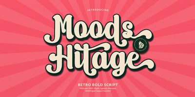
Moderately Font Family was designed by Alex Jacque and published by Alex Jacque. Moderately contains 1 styles and family package options. Introducing Moderately, a chunky and friendly typeface that makes a bold statement. This high-impact font is specifically crafted for designers seeking a display typeface with presence, perfect for applications where large, expressive type is a must.The defining features of Moderately include a generous x-height, soft curves, and tight spacing, ensuring a punchy and fresh aesthetic. Moderately is a deliberate departure from your contemporary sans with nary a straight line to see, embracing the organic and dynamic qualities reminiscent of blocky Art Nouveau typefaces, notably inspired by the works of Alfred Roller. While drawing influence from psychedelic / Art Nouveau revival typefaces of the 1960s, Moderately strikes a contemporary balance, delivering a design that is both impactful and approachable.Each glyph in Moderately attempts to maximize its space within the em square, incorporating slim carve outs for counters and apertures. The name “Moderately” adds a touch of irony, as this typeface is anything but plain – it exudes affable confidence and subtle flair.Created with versatility in mind, Moderately offers broad support for Latin-based languages, ensuring its adaptability for a wide range of creative projects.
