ID , 'designer' ); if (!empty($terms) && !is_wp_error($terms)) { foreach ( $terms as $term ) { $term_link = get_term_link( $term, 'designer' ); echo "Designer: " . $term->name . ""; } } ?>
ID ) ) . ' font" class="img-fluid">'; } ?>
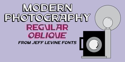
Modern Photography JNL Font Family was designed by Jeff Levine and published by Jeff Levine. Modern Photography JNL contains 2 styles and family package options. When two different people suggest a font idea, it’s best that it gets some attention.Both individuals forwarded an image of a photograph taken by Alfredo Camisa in 1958 entitled “Fotografia Moderna” (named after the subject of the photo). It was of a worn old building in Italy with crude hand lettering for its signage stating “Fotografia Moderna” [“Modern Photography]. The type styles were a mix of Art Nouveau and Art Deco, and at first it didn’t look like anything could be made of it… but after further study, the idea arose to blend the best of both lettering styles and come up with Modern Photography JNL, which is available in both regular and oblique versions.