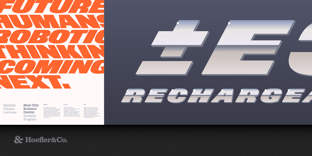
Nitro & Turbo Font Family was designed by Tobias Frere-Jones and Jonathan Hoefler and published by Hoefler & Co.. Nitro & Turbo contains 2 styles and family package options. Most type families begin with a roman font of moderate weight, and build outwards toward their peripheral bolds and italics. Nitro starts from the extreme — an aggressively sloped italic of massive weight — and adds an equal and opposite form, a backslanted style we call Turbo. The Nitro typeface was designed by Tobias Frere-Jones and Jonathan Hoefler in 2001. Originally part of a commission for the New York Jets football team, Nitro is an aggressively-sloped ‘superitalic,’ which in 2008 was supplemented by the left-leaning (or ‘backslanted’) Turbo typeface. Nitro and Turbo form an unconventional type family that contains two italics, but no roman. From the desk of the designer: We designed Nitro for Pentagram’s Michael Bierut, as part of a new identity for the New York Jets football team. Originally named Jets Bold, Nitro is rooted in the styles of lettering used by the team throughout its fifty-year history: even as its logotype evolved, it consistently used heavy, slanting forms to imply force and movement. Nitro embodies this indomitable spirit in the context of a fresh, contemporary design. Once we’d finished Nitro, we began thinking about where else designers might use such a typeface. (Action movies sprang immediately to mind: anything set in Nitro seems to invite a rousing soundtrack and a booming voiceover.) The typeface’s speed started us thinking about vehicles, and their unique typographic requirements: surely the font could work on the side of an express delivery van, a Formula One racecar, or a twin-engine aircraft, but on one side of the vehicle, wouldn’t the font face backwards? Enter Turbo. Nitro’s “Turbo” style is a contra-italic, more commonly known as a backslant. The backslant, a typographic curio dating to the early nineteenth century, was designed to attract attention by confounding the expectations of the eye. (This also makes backslants devilishly hard to draw, since their forms confound the natural movement of both the hand and the pen.) Both Nitro and Turbo share a fierce 28° slope, more than double the angle of most italics, giving each a determined and commanding voice. Together the fonts form a tight and unexpected family, useful wherever typography needs to demand attention and hold it.
