ID , 'designer' ); if (!empty($terms) && !is_wp_error($terms)) { foreach ( $terms as $term ) { $term_link = get_term_link( $term, 'designer' ); echo "Designer: " . $term->name . ""; } } ?>
ID ) ) . ' font" class="img-fluid">'; } ?>
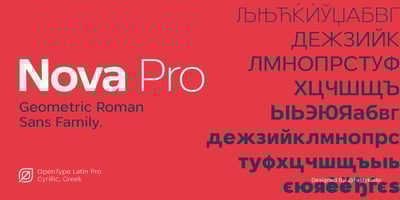
Nova Pro Font Family was designed by Faldy Kudo and published by XdCreative. Nova Pro contains 20 styles and family package options. The Fundamental ConceptThe fundamental concept of Nova Pro is to combine elements of sans-serif design with classical Roman typography, utilizing basic geometric shapes such as circles, triangles, and squares to create a clean and modern appearance.Anatomy of Nova Pro Ascender: The part of a letter that extends above the height of lowercase letters (x-height), as seen in letters like ‘b’, ‘d’, ‘h’, and ‘k’. Descender: The part of a letter that extends below the baseline, as in letters such as ‘g’, ‘j’, ‘p’, ‘q’, and ‘y’. Key Characteristics Simplicity: The design is clean and minimalist, without additional ornamentation. High Legibility: The design is clear and easily readable across various media sizes. Versatility: It can be used in a wide range of design contexts for body text and headlines. Nova Pro has Lowercase alternates; a,f,g,h,k,l,m,n,r,t, and Standard Ligatures. The Nova Pro is often used in modern graphic design and typography for purposes that require a professional, clean, and easily readable appearance.