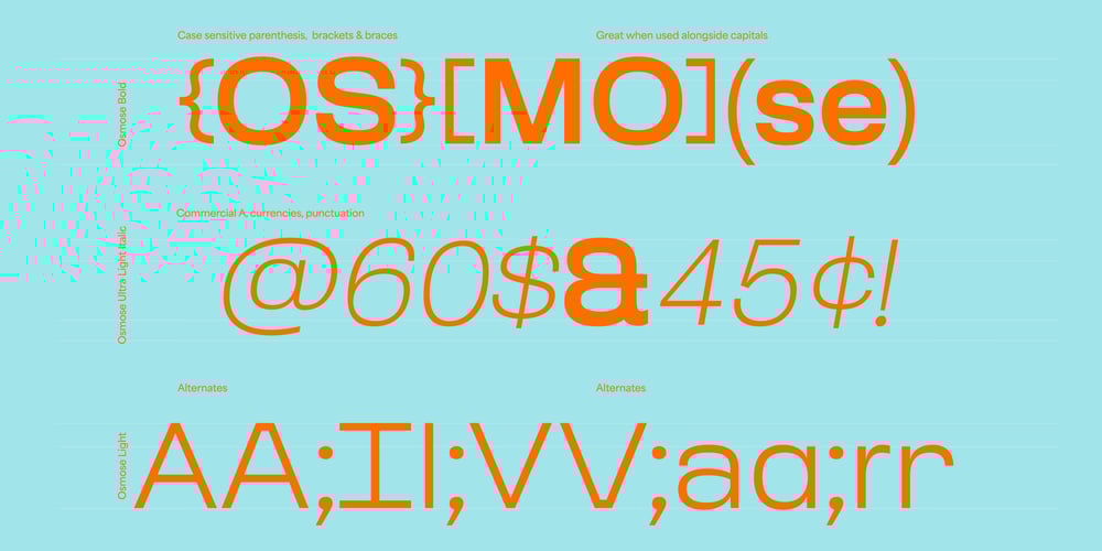
Osmose VF Font Family was designed by Léon Hugues, Matthieu Salvaggio and published by Blaze Type. Osmose VF contains 1 styles and family package options. Osmose is a neoclassical grotesk font rooted with geometric sans-serif features. The geometric inspiration is stated in the matching of the H-height and ascenders. Some details—such as the punctuation— were inspired by cursive old scriptures; it’s a nice way to break the monotony of long texts. By adding this layer made of smooth curves and perfectly round circles the effect can be even more detectable (and appreciable). Osmose’s capitals’ width are thought in the same way: they are built in a wider shape; allowing even more ‘flavour’ to the quality of the reading process. The Osmose font comes in five styles, all based on the same side bearings which allows great flexibility, and yet, optical constancy when it comes to text layouts.


