RM Hangle

RM Hangle Font Family was designed by Ray Meadows and published by Ray Meadows. RM Hangle contains 1 styles and family package options. This strong angular cousin of RM Hunky offers a bold display ...
RM Hangle Font Family was designed by Ray Meadows and published by Ray Meadows. RM Hangle contains 1 styles and family package options. This strong angular cousin of RM Hunky offers a bold display ...

Secret Diary Font Family was designed by David Kerkhoff and published by Hanoded. Secret Diary contains 1 styles and family package options. Secret Diary is a nice bit of uncomplicated handwriting: ...
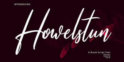
Howelstun Font Family was designed by Gilang Maulana and published by Maulana Creative. Howelstun contains 1 styles and family package options. Howelstun is a soft brush script font, with a light ...
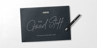
The Good Stuff Font Family was designed by Aldy Sidik and published by Epiclinez. The Good Stuff contains 1 styles and family package options. The Good Stuff is a handwritten signature script with a ...
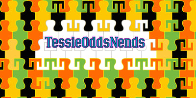
TessieOddsNends Font Family was designed by Robert Schenk and published by Ingrimayne Type. TessieOddsNends contains 2 styles and family package options. A tessellation is a shape that can be used to ...
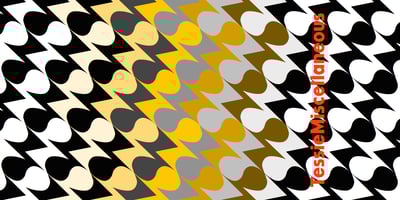
TessieMiscellaneous Font Family was designed by Robert Schenk and published by Ingrimayne Type. TessieMiscellaneous contains 2 styles and family package options. A tessellation is a shape that can be ...

Comicblast Font Family was designed by Coert De Decker and published by Kustomtype. Comicblast contains 8 styles and family package options. Comicblast is a comic and hand-drawn font family with a ...
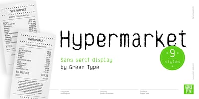
Hypermarket Font Family was designed by Dmitry Greshnev and published by Green Type. Hypermarket contains 9 styles and family package options. Hypermarket Font Family was designed by Dmitry Greshnev ...
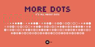
More Dots Font Family was designed by Hermen Grasman and published by Beware of the moose. More Dots contains 1 styles and family package options. It is not really a font, they are more icons. Based ...
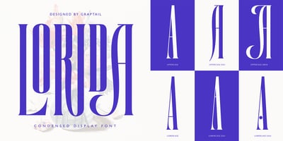
Lorida Font Family was designed by Teuku Deky Firnanda and published by Graptail. Lorida contains 1 styles and family package options. Lorida - Condensed Display is an Elegant Condensed serif with ...