Carnavale Delight

Carnavale Delight Font Family was designed by Dennis Sopczynski and published by T-26. Carnavale Delight contains 1 styles and family package options.
Carnavale Delight Font Family was designed by Dennis Sopczynski and published by T-26. Carnavale Delight contains 1 styles and family package options.

Station Font Family was designed by Kimmy Kirkwood and published by Kimmy Design. Station contains 7 styles and family package options. Station is a bold headline typeface inspired by old Train ...
La Coupole NF Font Family was designed by Nick Curtis and published by Nick's Fonts. La Coupole NF contains 1 styles and family package options. Lettering on a 1927 menu by prominent poster artist ...

Sensual Font Family was designed by Manuel Eduardo Corradine and published by Corradine Fonts. Sensual contains 6 styles and family package options. Sensual is ideal for invitations, greeting cards, ...
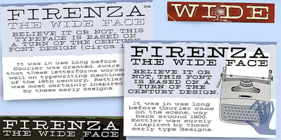
Firenza Font Family was designed by published by TypeArt Foundry. Firenza contains 4 styles and family package options.

Polen Font Family was designed by Iza W and published by Intellecta Design. Polen contains 2 styles and family package options. Polen is a soft, well elaborated and unusual font design. Works great ...

Innuendo Font Family was designed by David Kerkhoff and published by Hanoded. Innuendo contains 2 styles and family package options. Innuendo, despite its name, is a straightforward font. It is an ...
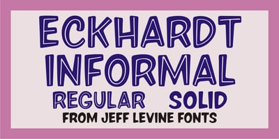
Eckhardt Informal JNL Font Family was designed by Jeff Levine and published by Jeff Levine. Eckhardt Informal JNL contains 2 styles and family package options. Eckhardt Informal JNL was found in a ...
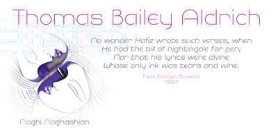
NaNa Pro Font Family was designed by Naghi Naghashian and published by Naghi Naghachian. NaNa Pro contains 10 styles and family package options. NaNa Pro Font family is designed by Naghi Naghashian. ...
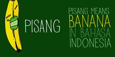
Pisang Font Family was designed by David Kerkhoff and published by Hanoded. Pisang contains 1 styles and family package options. Pisang means banana in Malay and Bahasa Indonesia. It is a tall, ...