Geovano
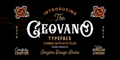
Geovano Font Family was designed by Akhmad Reza Fauzi and published by Grezline Studio. Geovano contains 8 styles and family package options. Geovano is a font family which has 4 styles; Display, ...
Geovano Font Family was designed by Akhmad Reza Fauzi and published by Grezline Studio. Geovano contains 8 styles and family package options. Geovano is a font family which has 4 styles; Display, ...
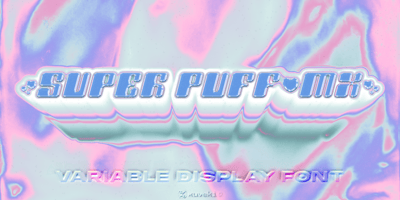
Super Puff MX Font Family was designed by Abe Zeinali and published by Xuveki. Super Puff MX contains 5 styles and family package options. Super Puff MX is a Y2K inspired variable display typeface ...
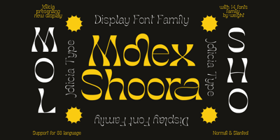
Molex Shoora Font Family was designed by Laire Banyu, Dyaharum Pungki Revitasari and published by Jolicia Type. Molex Shoora contains 14 styles and family package options. Molex Shoora is a typeface ...
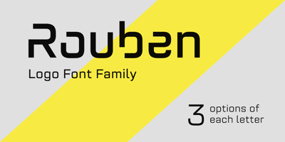
Rouben Font Family was designed by Roman Melikhov and published by Roman Melikhov. Rouben contains 11 styles and family package options. Rouben is a sans serif font family for creating minimalistic ...
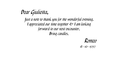
Italiko Font Family was designed by Luca Bolognese and published by Luca Bolognese. Italiko contains 4 styles and family package options. Italiko is a calligraphic font. The letters have been ...
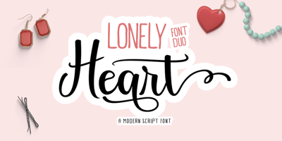
Lonely Heart Font Family was designed by Reza Haitami and published by Black Studio. Lonely Heart contains 2 styles and family package options. Lonely Heart Font Duo is a fancy font. which comes with ...
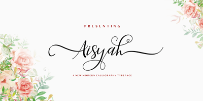
Aisyah Font Family was designed by Murtadha bin Sulaiman and published by Malindo Creative. Aisyah contains 1 styles and family package options. Aisyah is a modern hand-based typography, This font is ...
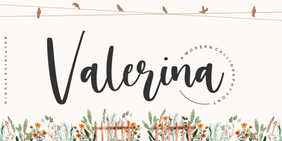
Valerina Font Family was designed by Restu Angga and published by Balpirick. Valerina contains 1 styles and family package options. Proudly Present, Valerina Font.Valerina is a modern calligraphy ...
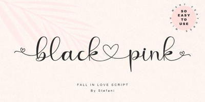
Black Love Pink Font Family was designed by Stefani Tri Rosa Setiati Christiana and published by Stefani Letter. Black Love Pink contains 2 styles and family package options. Carefully designed, ...
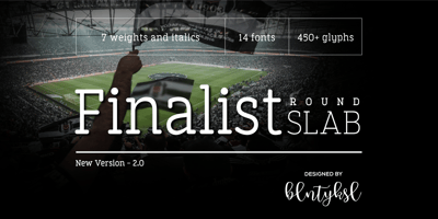
Finalist Round Slab Font Family was designed by Bülent Yüksel and published by Bülent Yüksel. Finalist Round Slab contains 14 styles and family package options. The font was intended primarily to ...