ID , 'designer' ); if (!empty($terms) && !is_wp_error($terms)) { foreach ( $terms as $term ) { $term_link = get_term_link( $term, 'designer' ); echo "Designer: " . $term->name . ""; } } ?>
ID ) ) . ' font" class="img-fluid">'; } ?>
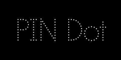
PIN Dot Font Family was designed by Hoon Kim, Jin Kim and published by Colophon Foundry. PIN Dot contains 1 styles and family package options. Conceived by Korean-born, New York-based Hoon Kim of design consultancy Why Not Smile, PIN is a three-weight, nine-cut family of geometric sans-serif types. The design, available in dot-matrix, stencil and solid variations, is based on an expanding grid in which each weight rests comfortably within the other, expanding out from the stroke’s center-point. Initiated by Kim after a chance look towards the ceiling in a London tube station—which revealed a circular, 24-bulb chandelier above—the project started with a 16-node variation on a geometric dot matrix and grew from there to ultimately include three styles and three weights, each applicable across body copy, headlines, and tables. With a nearly monolinear stroke width and unique construction, PIN is intended to be mixed and matched liberally: lighter weights adjacent to darker ones, stencil alongside solid —a type family in the traditional sense of the word.