ID , 'designer' ); if (!empty($terms) && !is_wp_error($terms)) { foreach ( $terms as $term ) { $term_link = get_term_link( $term, 'designer' ); echo "Designer: " . $term->name . ""; } } ?>
ID ) ) . ' font" class="img-fluid">'; } ?>
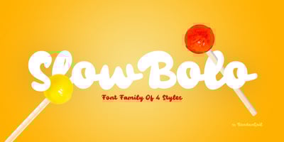
Slow Bolo Font Family was designed by Wahyu Eka Prasetya, Bondan Gail Saputro and published by BondanGail. Slow Bolo contains 4 styles and family package options. Slowbolo concept is a playful and eye-catching display typeface characterized by its thick, rounded strokes and exaggerated curves. The absence of serifs and the uniform stroke thickness give it a modern yet retro feel, reminiscent of 1960s or 70s typography. Its soft, bubbly appearance is further enhanced by rounded terminals and smooth, connecting strokes between letters, creating a sense of fluidity and unity.Well-suited for branding and design projects that aim to evoke a sense of fun and nostalgia, this typeface would be ideal for food-related businesses like ice cream parlors and bakeries, children’s products, party invitations, and retro-themed advertisements. The font’s friendly and approachable demeanor, combined with its bold visual presence, makes it an excellent choice for capturing attention and conveying a sense of joy and whimsy.