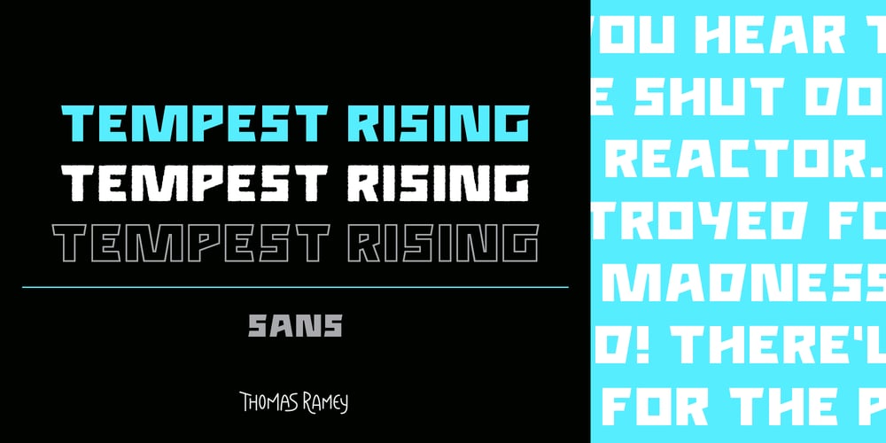
Tempest Rising Sans Font Family was designed by Thomas Ramey and published by Thomas Ramey Design. Tempest Rising Sans contains 5 styles and family package options. Tempest Rising is a powerful sans serif font that channels the energy of a storm brewing on the horizon. Its thick, bold glyphs create a sense of authority and strength, while its sharp angles and precise lines evoke a spirit of rebellion and defiance. Each character is meticulously designed with many alternatives to fit your purpose, making the font perfect for headlines, posters, branding, and anywhere a bold statement needs to be made.The typography is compact and dense, with condensed forms that allow for maximum use of space without sacrificing legibility. Its geometric foundation gives it a modern edge, while the sharp angles introduce a sense of urgency and momentum. The font’s architecture balances between brutal force and refined precision, making it versatile for both high-energy, dynamic designs and minimal, structured layouts.What truly sets Tempest Rising apart is its unyielding presence. It doesn’t just occupy space—it dominates it, bringing a sense of gravity and intensity to any project. Whether paired with vibrant colors for a striking, avant-garde look, or set against monochrome backdrops for a more dramatic, tension-filled composition, the font adapts effortlessly. Its bold strokes cut through the visual landscape like thunder, resonating with clarity and purpose.The subtle details—like the aggressive tapering of strokes and sharp corners—echo the sounds of revolution, the feeling of something immense stirring beneath the surface. There’s a sense of tension and release in its form, reminiscent of the quiet before a storm that builds into a sweeping crescendo. Tempest Rising is more than a font; it’s a declaration, a symbol of strength and change, a visual embodiment of power, courage, and momentum.


