User Rating: Be the first one!
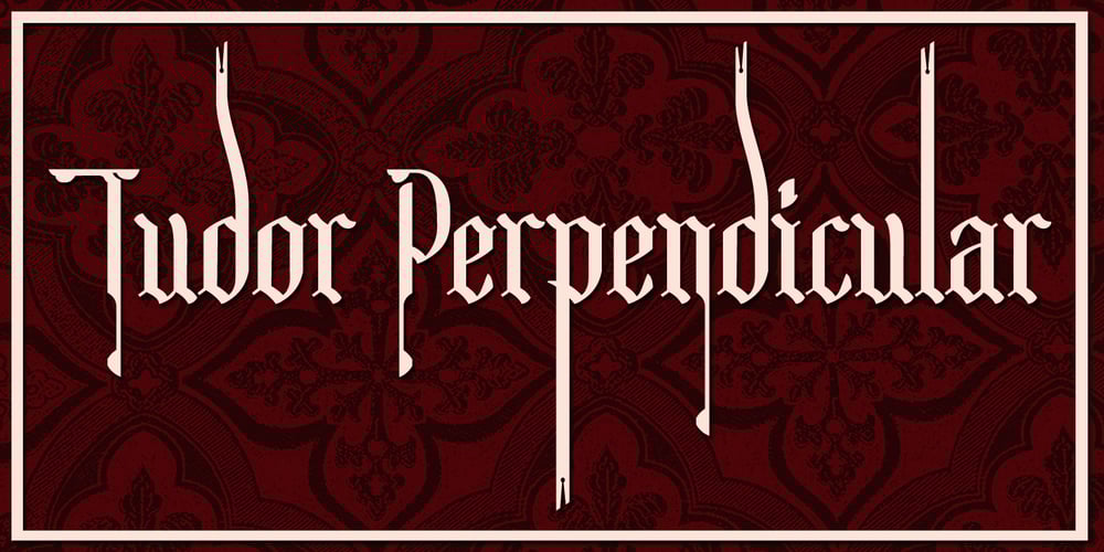
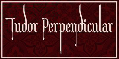
Tudor Perpendicular Font Family was designed by Paul James Lloyd and published by Greater Albion Typefounders. Tudor Perpendicular contains 1 styles and family package options. Tudor Perpendicular is Greater Albion’s seasonal Black letter release (not that we rule out the possibility of non-seasonal ones…) for 2012. As the name suggests, it is a design which emphasises, and yes, exaggerates for effect, the perpendicular up and down nature of Black Letter typefaces. There’s no particular historical basis for this one – straight out of our own minds, just as a lot of Black letter ‘revivals’ have been over the years. Come and visit ‘Ye Olde’ world today…