User Rating: Be the first one!
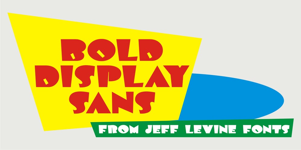
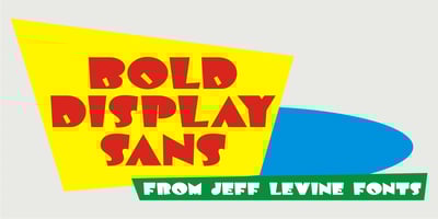
Bold Display Sans JNL Font Family was designed by Jeff Levine and published by Jeff Levine. Bold Display Sans JNL contains 1 styles and family package options. Bold Display Sans JNL is loosely based on one of the classic alphabets found within a Speedball Lettering Textbook of the 1940s; itself called “Bold Display”. The original featured a stippled texture and inline curves placed in random patterns throughout the letters. This more simplified, all-caps version is for titling requirements where a strong, yet casual design is needed.