User Rating: Be the first one!

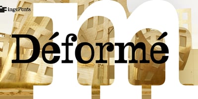
DeForme Font Family was designed by Ingo Zimmermann and published by Ingo. DeForme contains 1 styles and family package options. A deconstructive variation of ”Clarendon“DéFormé was born out of the distortion of the time-honored ”Clarendon“ letterforms, in which the stems and thin strokes have been reversed. Thus, a typeface was created which will remind some readers of a Western typeface, and others of the ordinary typeface of a typewriter.Actually, it is still a robust Clarendon, which has survived ists disfigurement quite well. DéFormé, like its ”mother“, is easily legible, in spite of the inherent emphasis which one is not used to seeing.