Fello
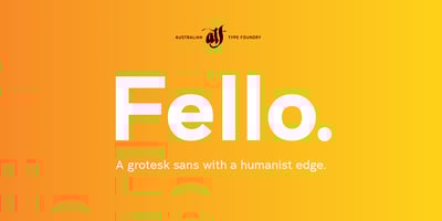
Fello Font Family was designed by Wayne Thompson and published by Australian Type Foundry. Fello contains 3 styles and family package options. Fello is a geometric sans-serif with a university ...
Fello Font Family was designed by Wayne Thompson and published by Australian Type Foundry. Fello contains 3 styles and family package options. Fello is a geometric sans-serif with a university ...
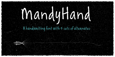
Mandy Hand Font Family was designed by Wayne Thompson and published by Australian Type Foundry. Mandy Hand contains 1 styles and family package options. MandyHand is a lighthearted handwriting font ...

BosinNova Font Family was designed by Wayne Thompson and published by Australian Type Foundry. BosinNova contains 1 styles and family package options. A quirky and informal handwriting font
Otis Condensed Font Family was designed by Wayne Thompson and published by Australian Type Foundry. Otis Condensed contains 1 styles and family package options. The name Otis arose from an incident ...
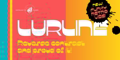
Lurline Font Family was designed by Wayne Thompson and published by Australian Type Foundry. Lurline contains 1 styles and family package options. With deliberately tight kerning, Lurline wears its ...
Architect Font Family was designed by Wayne Thompson and published by Australian Type Foundry. Architect contains 5 styles and family package options. Based on the text on architect's plans. The ...
Euron Font Family was designed by Wayne Thompson and published by Australian Type Foundry. Euron contains 1 styles and family package options. Euron arose out of a restaurant sign in Sydney, ...
Spud Font Family was designed by Wayne Thompson and published by Australian Type Foundry. Spud contains 6 styles and family package options. Capturing the free flowing feel of handwriting in a font ...
Barkpipe Font Family was designed by Wayne Thompson and published by Australian Type Foundry. Barkpipe contains 6 styles and family package options. This face has a stiff machine-like quality which ...
Axiom Font Family was designed by Wayne Thompson and published by Australian Type Foundry. Axiom contains 6 styles and family package options. Influenced heavily by the work of Erik Spiekerman, Axiom ...