CA Telecopy
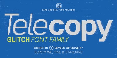
CA Telecopy Font Family was designed by Thomas Schostok and published by Cape Arcona Type Foundry. CA Telecopy contains 24 styles and family package options. Introducing CA Telecopy, a unique ...
CA Telecopy Font Family was designed by Thomas Schostok and published by Cape Arcona Type Foundry. CA Telecopy contains 24 styles and family package options. Introducing CA Telecopy, a unique ...
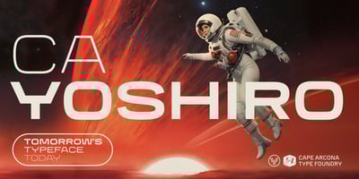
CA Yoshiro Font Family was designed by Thomas Schostok and published by Cape Arcona Type Foundry. CA Yoshiro contains 10 styles and family package options. Tomorrow’s Typeface TodayAre you ready to ...

CA Superpilot Font Family was designed by Thomas Schostok and published by Cape Arcona Type Foundry. CA Superpilot contains 12 styles and family package options. Introducing the CA Superpilot Sans & ...

CA Spotnik Font Family was designed by Stefan Claudius and published by Cape Arcona Type Foundry. CA Spotnik contains 12 styles and family package options. The initial inspiration for CA Spotnik was ...
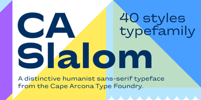
CA Slalom Extended Font Family was designed by Stefan Claudius and published by Cape Arcona Type Foundry. CA Slalom Extended contains 10 styles and family package options. The starting point for CA ...
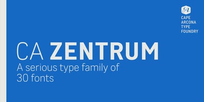
CA Zentrum Font Family was designed by Thomas Schostok and published by Cape Arcona Type Foundry. CA Zentrum contains 30 styles and family package options. CA Zentrum is a compelling mix of ...

CA Monodon Font Family was designed by Donald Beekman and published by Cape Arcona Type Foundry. CA Monodon contains 9 styles and family package options. Don't mistake Monodon for Monotone: It's ...
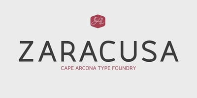
CA Zaracusa Font Family was designed by Stefan Claudius and published by Cape Arcona Type Foundry. CA Zaracusa contains 24 styles and family package options. CA Zaracusa was designed as a CI font for ...

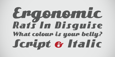
CA Rebel Party Rebel Font Family was designed by Thomas Schostok and published by Cape Arcona Type Foundry. CA Rebel Party Rebel contains 2 styles and family package options. After throwing a ...
CA Emeralda Font Family was designed by Stefan Claudius and published by Cape Arcona Type Foundry. CA Emeralda contains 2 styles and family package options. The Italic version of CA Emeralda was ...