Subix
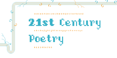
Subix Font Family was designed by Valérie Desrochers and published by Subtitude. Subix contains 2 styles and family package options. Sub experimention with bitmap fonts created subix. A semi serif ...

Subix Font Family was designed by Valérie Desrochers and published by Subtitude. Subix contains 2 styles and family package options. Sub experimention with bitmap fonts created subix. A semi serif ...
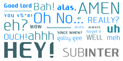
Subinter Font Family was designed by Valérie Desrochers, Sébastien Théraulaz and published by Subtitude. Subinter contains 2 styles and family package options. The first elements of the Subinter font ...

Subasmet Font Family was designed by Valérie Desrochers and published by Subtitude. Subasmet contains 1 styles and family package options. The font Subasmet is a package of funky horoscope and other ...

Subikto Tree Font Family was designed by Valérie Desrochers, Sébastien Théraulaz and published by Subtitude. Subikto Tree contains 1 styles and family package options. Subikto Tree is an ode to ...

Subzoete Font Family was designed by Valérie Desrochers and published by Subtitude. Subzoete contains 1 styles and family package options. Subzoete is a gathering of icons used in a cultural agenda ...
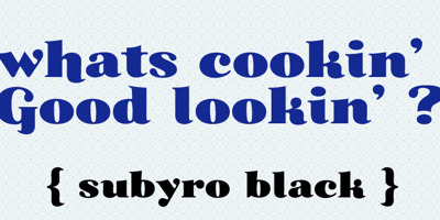
Subytro Font Family was designed by Valérie Desrochers and published by Subtitude. Subytro contains 1 styles and family package options. Subytro! Use this font for sweet bold titles. It adds ...
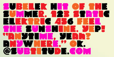
Subelek Font Family was designed by Valérie Desrochers and published by Subtitude. Subelek contains 1 styles and family package options. First developped for a logo that was rejected we made a font ...

SubiktoTwo Font Family was designed by Valérie Desrochers, Sébastien Théraulaz and published by Subtitude. SubiktoTwo contains 1 styles and family package options. The first flower that was created ...

Subikto One Font Family was designed by Valérie Desrochers, Sébastien Théraulaz and published by Subtitude. Subikto One contains 1 styles and family package options. Subikto One is the first of a ...
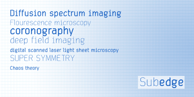
Subedge Font Family was designed by published by Subtitude. Subedge contains 2 styles and family package options. Subedge is an angular font made for short notice and cold explanations. Use it in ...