User Rating: Be the first one!
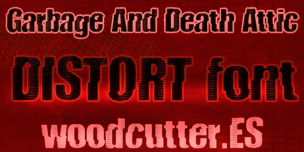
Garbage And Death Attic Font Family was designed by Jordi Manero and published by Woodcutter. Garbage And Death Attic contains 1 styles and family package options. “Garbage and Death Attic” is a distorted font, as if affected by interference, giving it a unique and chaotic appearance. The letters seem to vibrate and fragment, creating a sense of constant motion. With both uppercase and lowercase letters, this typeface never fully solidifies, making it perfect for designs that aim to convey a sense of disorder and confusion. Ideal for creative projects that want to stand out with a touch of rebellion and visual chaos. “Garbage and Death Attic” is the perfect choice to break away from the conventional and explore new aesthetic boundaries.


