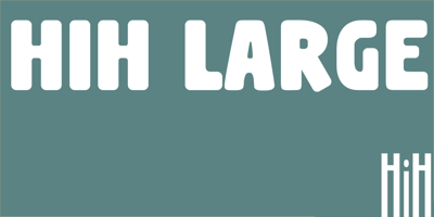
HiH Large Font Family was designed by published by HiH. HiH Large contains 1 styles and family package options. HiH Large is another “Hey, Look at me” font, somewhat similar to our Shout, but with rounded corners. As a result it is softer and friendlier than Shout. It is appropriate to similar applications requiring an attention-getting font, such as posters, flyers and ads. HiH Large uses our new encoding, as noted in the All_customer_readme.txt. The Euro symbol has been moved to position 128 and the Zcaron/zcaron have been added at positions 142/158 respectively. Otherwise, HiH Large has the usual HiH idiosyncratic glyph selection, with the German ch/ck instead of braces and our usual Hand-in-Hand symbol. Also included are several useful ligatures, as shown in the PDF files found in the gallery. The basic HiH Large family includes a regular font and two oblique fonts: Recline, leaning to the left and Incline, leaning to the right. This has more to do with which hand a person writes with than any indication of political persuasion. Display obliques like these are useful for imparting a sense of movement to a design. Conversely, the upright regular is very grounded, creating a feeling of stability in uncertain times.