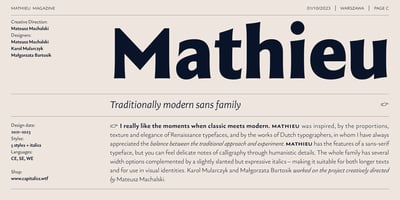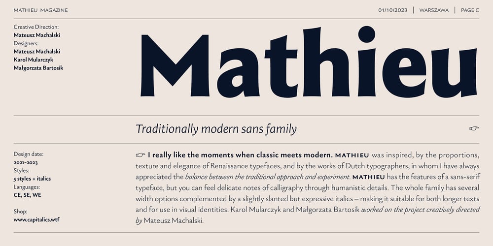
Mathieu Sans Font Family was designed by Mateusz Machalski and published by Machalski. Mathieu Sans contains 10 styles and family package options. I really like the moments when classic meets modern. Mathieu was inspired, by the proportions, texture and elegance of Renaissance typefaces, and by the works of Dutch typographers, in whom I have always appreciated the balance between the traditional approach and experiment. Mathieu has the features of a sans-serif typeface, but you can feel delicate notes of calligraphy through humanistic details. The whole family has several width options complemented by a slightly slanted but expressive italics – making it suitable for both longer texts and for use in visual identities. Karol Mularczyk and Małgorzata Bartosik worked on the project creatively directed by Mateusz Machalski.